Caterpillar Digital offers a mentorship program for Bradley University’s students. Design students work alongside Caterpillar UXers to create a design for the company, from persona research all the way to pitch day.
01.
Introduction
Every year, Caterpillar Digital challenges students to fix a design problem for World Usability Day. During this project, I worked with two other Bradley students alongside Caterpillar UX leads to redesign Caterpillar’s online pre-registration system.
02.
About the Client
Caterpillar is the world’s largest company specializing in construction and engineering equipment. You already know who Cat is, because you’ve seen the iconic black and yellow logo on a truck before. Cat is a huge, multinational operation, and needs UX designers to help smooth out their processes.
We worked with Caterpillar Digital to help Cat’s S.O.S. Labs Caterpillar’s clients use a lot of heavy machinery. It is important to make sure this machinery is in top shape for the health and safety of the people using it, which is where S.O.S. labs come in. These labs are responsible for analyzing fluid (diesel, coolant and oil) from heavy machines to make sure they are all running properly. It’s kind of like how people have to go in for an annual checkup. These checkups help prevent catastrophic failures and reduce operating costs for clients.
03.
Challenges
The problem facing S.O.S Labs is online pre-registration. Pre-registration is incredibly important for lab technicians to be able to do their jobs correctly. But, digital pre-registration is only used about 30% of the time when it comes to SOS submissions. Most clients currently rely on paper-and-pencil submissions, which can be hard to read and hard to manage. The goal is to increase digital pre-registration to 70%.
We encountered a lot of pain points in Caterpillar’s original website for S.O.S Labs. The main problems we encountered were:
1. Un-Intuitive Design. Overall, the website appears overwhelming. With so much information densely packed on a page, it can be difficult to navigate and get the necessary information across. This is especially frustrating for users who are used to a paper-and-pencil system and are unfamiliar with digital services.
2. Manual Entry. Registering heavy machinery required a lot of information. From the make and model to the type of oil used, it can get very specific very quickly. Unfortunately, there isn’t a lot of auto-population on the website. Almost all of the information has to be manually entered by the user, which can be time consuming and frustrating.
3.Lots of Steps. Aside from adding a lot of information manually, there are a lot of steps to complete the process of online pre-registration, and it takes longer to do than to write it down physically. We wanted to simplify this process so that it would create a streamlined experience for users.
4. Connectivity Issues. Heavy machinery is often used in the field, away from consistent wifi. Users aren’t able to take down information right away, because they need to have access to a computer connected to the Internet.
04.
Solutions
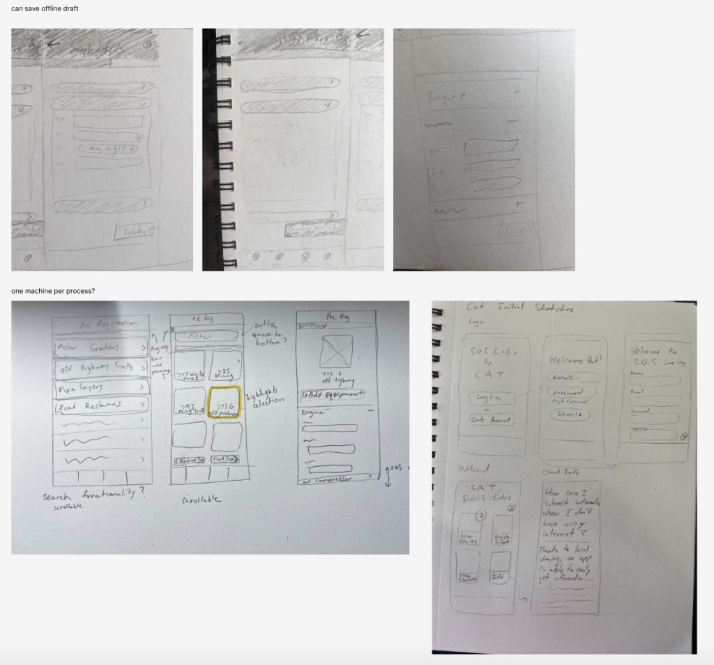
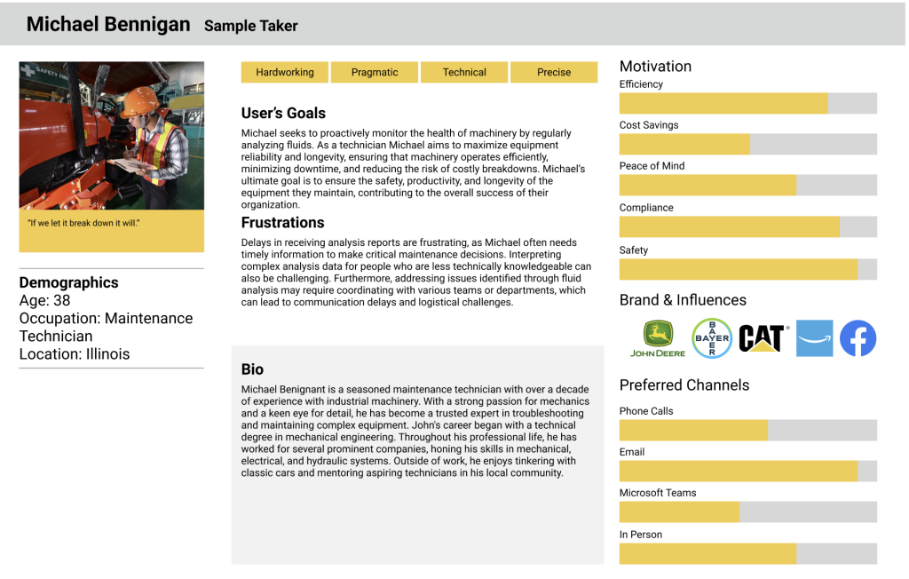
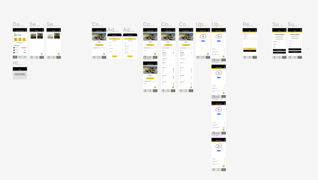
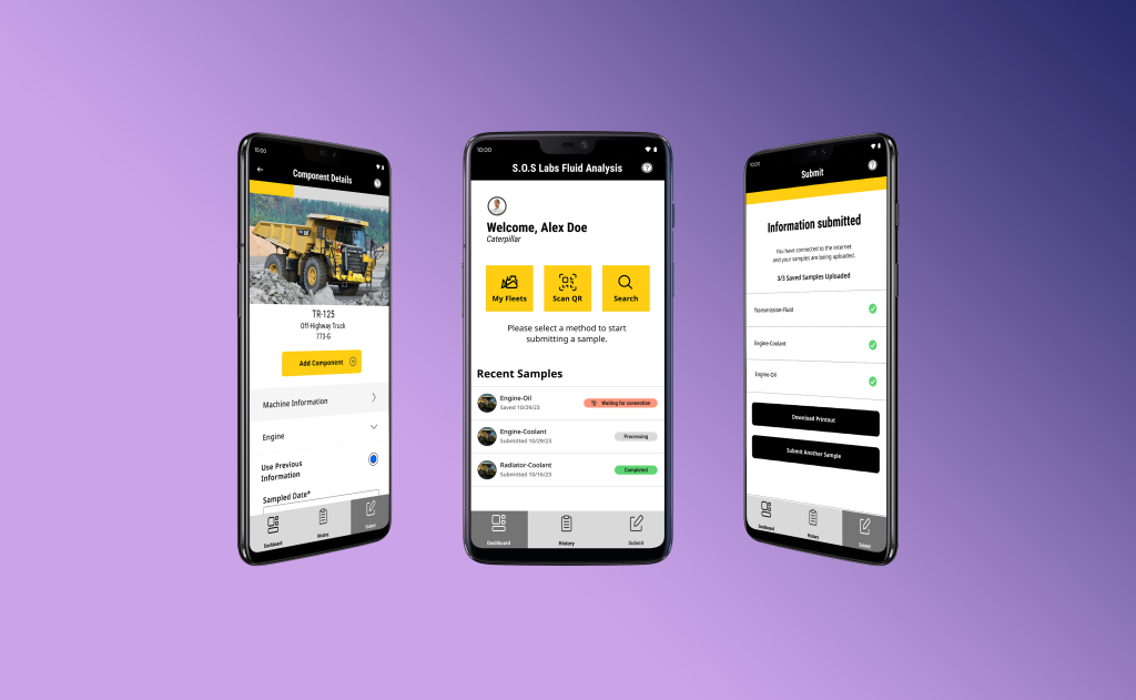
Before we started designing, we had to do research. We went on a tour of the S.O.S. Labs to talk to lab technicians and get a better understanding of their pain points. Using this research and our understanding of their current system, we made proto-personas to keep our users at the center of the process. After initial research, we started designing. We decided to make a mobile app with offline storage capabilities. This would let users be more flexible in where they can pre-register their machines. We also simplified the pre-registration steps with the goal of making it easier to use than a paper form.
We implemented agile methodology and worked in one-week sprints. In each sprint, we would work on a unique part of the project, get feedback from our Caterpillar design leads, and iterate based on their feedback.
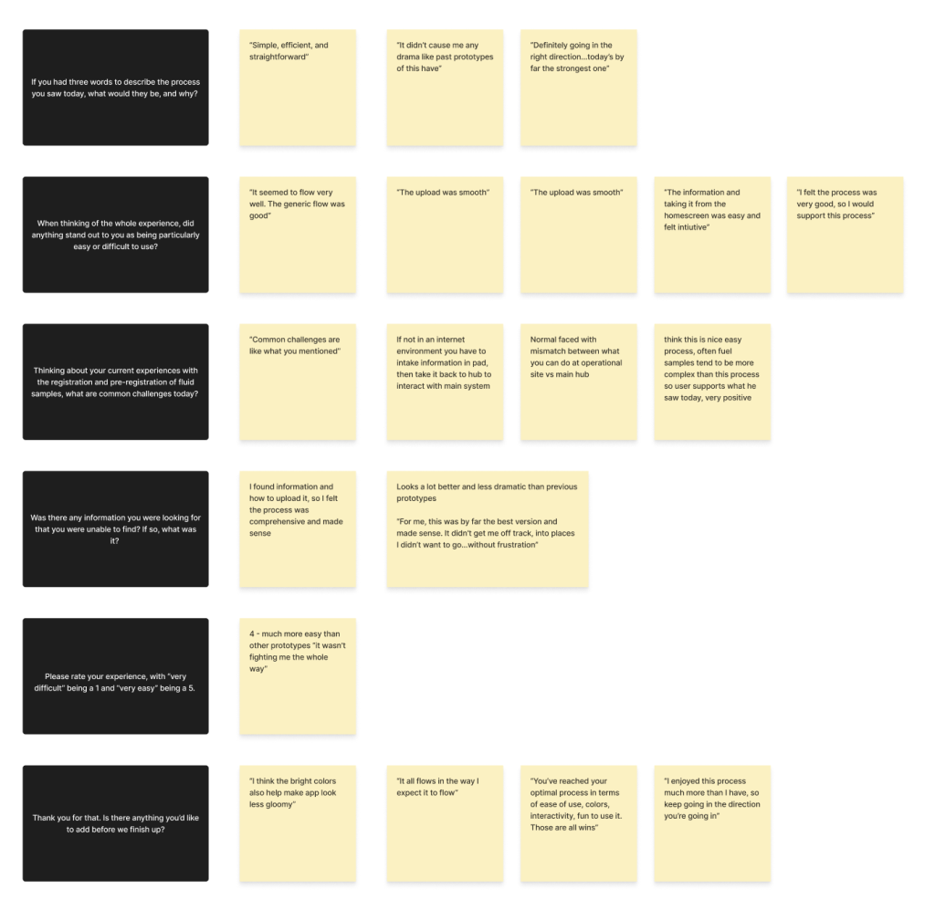
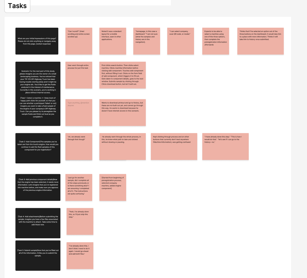
Once we had a working design prototype, we used UserTesting.com to gain feedback from heavy machinists, who would be using the pre-registration app. We did a research workshop with our Caterpillar leads and iterated on our app with the user testing in mind.
05.
Results
We pitched our app idea to Caterpillar in celebration of World Usability Day. After four months of work, it was incredibly exciting (and anxiety-inducing!) to be able to show off our work to professional designers. In the end, my team took home first place in the design competition. It was incredibly rewarding to see our hard work pay off, and I hope I can solve more problems in the future.
01. Introduction
Every year, Caterpillar Digital challenges students to fix a design problem for World Usability Day. During this project, I worked with two other Bradley students alongside Caterpillar UX leads to redesign Caterpillar’s online pre-registration system.
02. About the Client
Caterpillar is the world’s largest company specializing in construction and engineering equipment. You already know who Cat is, because you’ve seen the iconic black and yellow logo on a truck before. Cat is a huge, multinational operation, and needs UX designers to help smooth out their processes.
We worked with Caterpillar Digital to help Cat’s S.O.S. Labs Caterpillar’s clients use a lot of heavy machinery. It is important to make sure this machinery is in top shape for the health and safety of the people using it, which is where S.O.S. labs come in. These labs are responsible for analyzing fluid (diesel, coolant and oil) from heavy machines to make sure they are all running properly. It’s kind of like how people have to go in for an annual checkup. These checkups help prevent catastrophic failures and reduce operating costs for clients.
03. Challenges
The problem facing S.O.S Labs is online pre-registration. Pre-registration is incredibly important for lab technicians to be able to do their jobs correctly. But, digital pre-registration is only used about 30% of the time when it comes to SOS submissions. Most clients currently rely on paper-and-pencil submissions, which can be hard to read and hard to manage. The goal is to increase digital pre-registration to 70%.
We encountered a lot of pain points in Caterpillar’s original website for S.O.S Labs. The main problems we encountered were:
1. Un-Intuitive Design. Overall, the website appears overwhelming. With so much information densely packed on a page, it can be difficult to navigate and get the necessary information across. This is especially frustrating for users who are used to a paper-and-pencil system and are unfamiliar with digital services.
2. Manual Entry. Registering heavy machinery required a lot of information. From the make and model to the type of oil used, it can get very specific very quickly. Unfortunately, there isn’t a lot of auto-population on the website. Almost all of the information has to be manually entered by the user, which can be time consuming and frustrating.
3.Lots of Steps. Aside from adding a lot of information manually, there are a lot of steps to complete the process of online pre-registration, and it takes longer to do than to write it down physically. We wanted to simplify this process so that it would create a streamlined experience for users.
4. Connectivity Issues. Heavy machinery is often used in the field, away from consistent wifi. Users aren’t able to take down information right away, because they need to have access to a computer connected to the Internet.
04. Solutions
Before we started designing, we had to do research. We went on a tour of the S.O.S. Labs to talk to lab technicians and get a better understanding of their pain points. Using this research and our understanding of their current system, we made proto-personas to keep our users at the center of the process. After initial research, we started designing. We decided to make a mobile app with offline storage capabilities. This would let users be more flexible in where they can pre-register their machines. We also simplified the pre-registration steps with the goal of making it easier to use than a paper form.
We implemented agile methodology and worked in one-week sprints. In each sprint, we would work on a unique part of the project, get feedback from our Caterpillar design leads, and iterate based on their feedback.
Once we had a working design prototype, we used UserTesting.com to gain feedback from heavy machinists, who would be using the pre-registration app. We did a research workshop with our Caterpillar leads and iterated on our app with the user testing in mind.
05. Results
We pitched our app idea to Caterpillar in celebration of World Usability Day. After four months of work, it was incredibly exciting (and anxiety-inducing!) to be able to show off our work to professional designers. In the end, my team took home first place in the design competition. It was incredibly rewarding to see our hard work pay off, and I hope I can solve more problems in the future.